Tuesday, 13 September 2011
Advert analysis
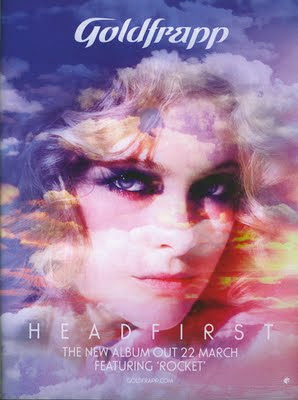
The album advert i have chosen to analyse is Goldfrapp - Headfirst. The main colours used in this advert are yellow, pink, white and purple which contribute to the dreamy image that the clouds create. Superimposition is used of the face of Goldfrapp layered on top of the clouds which also creates a dream like image. The colour scheme and editing used creates a visual image of her music and gives us the idea that it is fantasy like which is the same as her videos and her song 'Rocket'. It also gives us the idea that her music is bright and happy along with the colour scheme and image. The text used for the album name is very simple which makes us focus more on the image than the information and the bold text which says 'Goldfrapp' which is used stands out so that the audience immediately recognise the artist.
Subscribe to:
Post Comments (Atom)

No comments:
Post a Comment